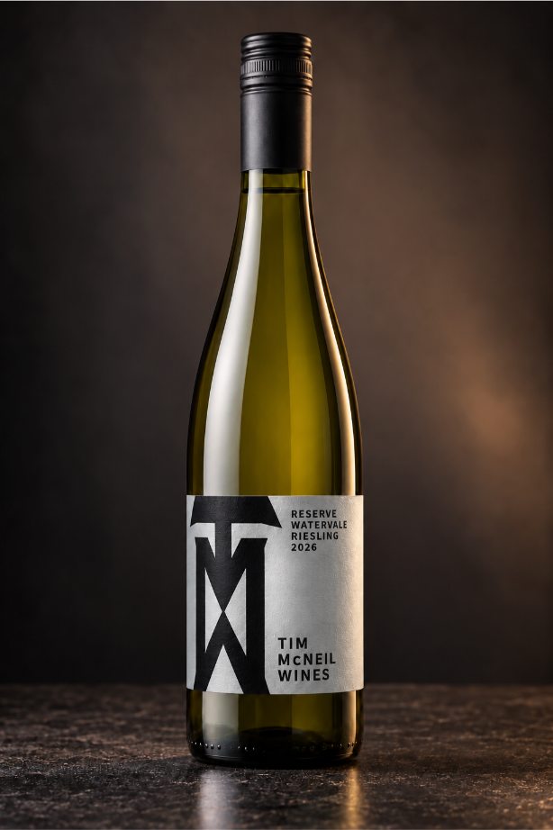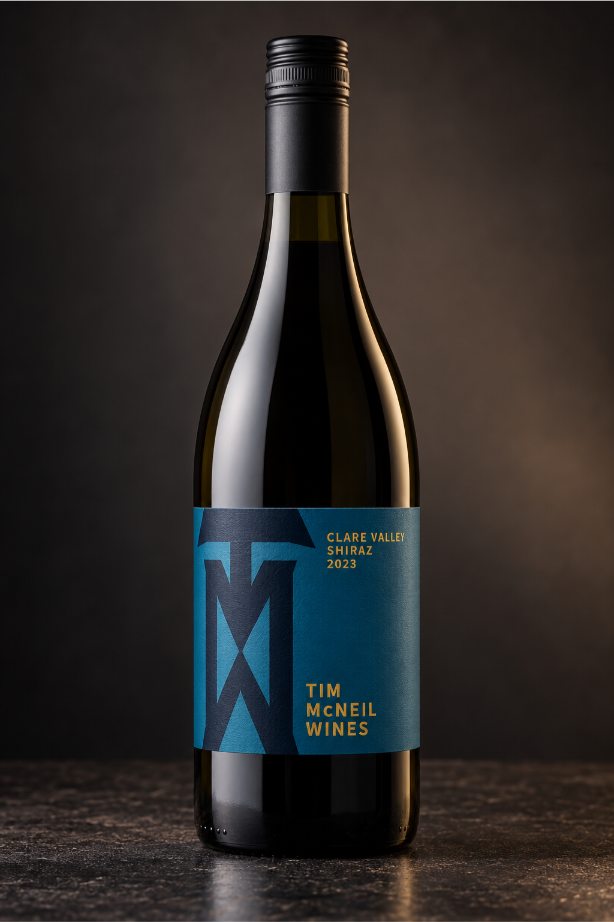
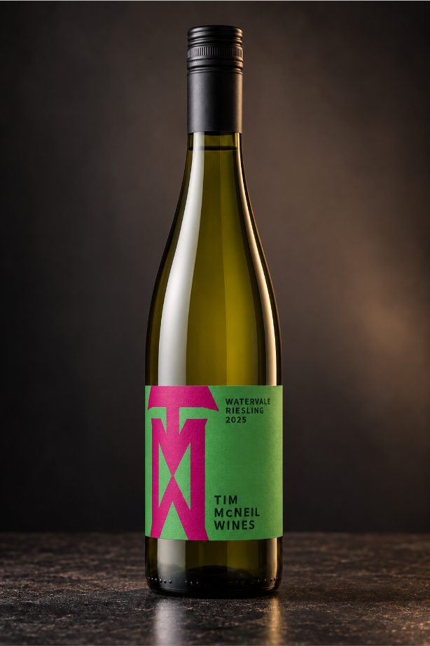
We have worked with Tim McNeil for many years, but it is always a special occasion when an old client says “let’s do something new”.
And so we got to work.
We wanted something impactful, and strong, that would also translate well across multiple wines. Fairly quickly we settled on a graphic created stacking TMW. This shape had a strong presence, a lot like Tim himself. Leaning into different colour combinations we were able to communicate each of the wine’s personality.
- Wine Label Design